Visualizing honeypot activity
Certain honeypot intruders are quite persistently trying to open outbound SSH tunnels, as described in an earlier article. So far I’ve seen a lot of attempts to open tunnels towards mail server TCP ports 25 (SMTP), 465 (SMTPS) and 587 (submission); web servers on TCP ports 80 (HTTP) and 443 (HTTPS); but also several other TCP ports.
For visualizing the activity, I fed the logs to AfterGlow. Below is shown a diagram of attempted SSH tunnels, where the intruders’ IP addresses are shown as red circles, the ports to which they attempt to connect are are light blue, and the targets are yellow triangles.
As the diagram shows, certain targets are attacked from different intruders (although with adjacent IP addresses). The objects’ sizes indicate frequency.

Simple honeypot map (one day only, low activity)
Another diagram, illustrating the frequency of attacks:

One day of activity, two attackers. Still mostly readable.
Feeding two weeks of logs to AfterGlow was less informative. The graph clearly shows that certain sources are very busy, and certain destinations are frequently attacked – but that’s about where the diagram stops being useful.
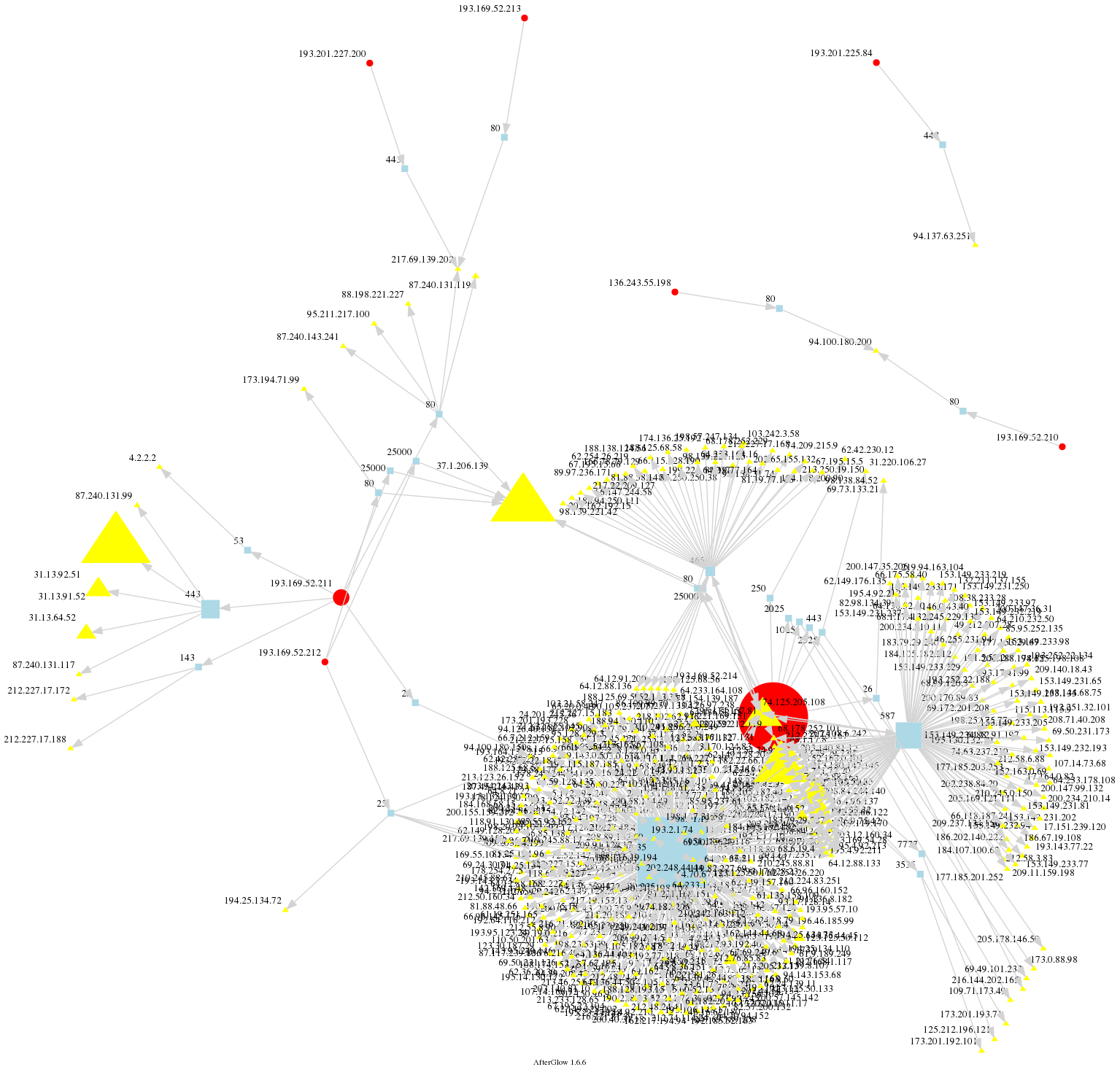
Complex honeypot map (two weeks)
In combination with some drill-down details, AfterGlow could be quite useful for analyzing details. I’ve got two items on my AfterGlow wishlist: 1) that labels go on top of objects, and 2) better avoidance logic so that objects do not cover other objects.
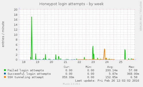
The corresponding Munin graph is also registering SSH tunneling attempts.