Visualizing honeypot activity, part II: Tree maps
In some earlier posts, I’ve written about bots bruteforcing their way into my Cowrie honeypot, and trying to establish outbound tunnels from there. While regular honeypot activity will often produce interesting logs of intrusion attempts and malware downloads, this kind of monotonous activity is less interesting from an analysis-point-of-view. However, the activity is still interesting and produces nice metrics, and metrics can be graphed and visualized. For a single day’s activity I’m using AfterGlow, which is really nice for smaller volumes of data. For larger volumes, I’ve found tree maps more informative. I tried out a few treemapping tools, but the easiest (and more web friendly) I found was available from Highcharts who provides an impressive range of graphing/visualization javascript libraries.
The tree maps can be constructed to allow you to drill down to every level of detail. For visualizing tunneling activity through the honeypot it’s sufficient with three levels, in increasing order based on the number of occurrences:
- The source IP address of the bot (very few)
- The destination port (few)
- The destination IP address (a lot)
On the top level this gives me a map as shown below. The different colours represent different source IP addresses, and some of the destination ports are shown where there’s room for it. As the yellow part of the tree map shows, there’s a lot of activity from the IP address 193.169.52.214, with 7121 attempts (so far) to establish outbound TCP connections. The blue part of the map represents another IP address with a higher number of connection attempts, but its activity is less varied than the yellow part. The number of attempts is shown by hovering the mouse over the general areas (not here though, since this is just a screenshot…).
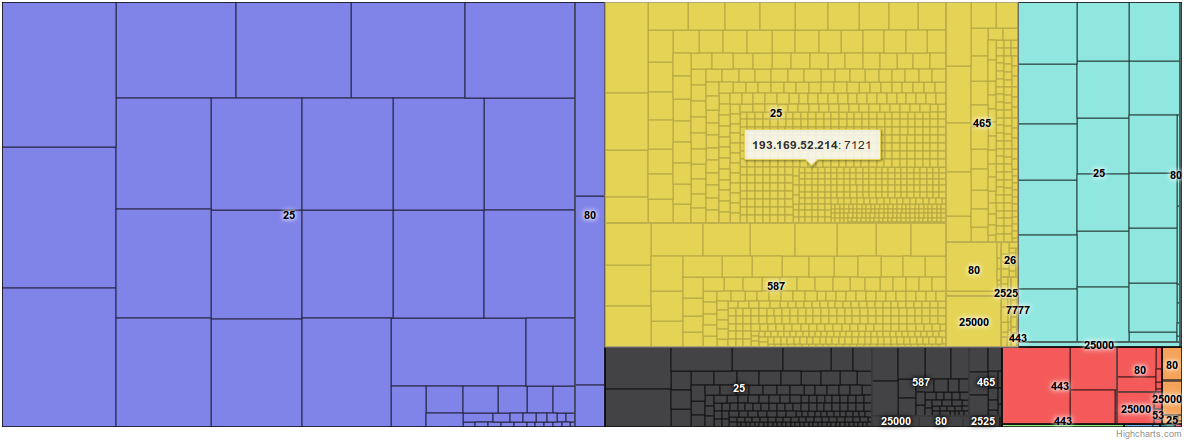
By hovering the mouse over the port numbers, the map shows that of these 7121 attempts, 3763 have targeted port 25 on a lot of destination systems, each system represented by a rectangle within the yellow area. As we can see, this IP address has also attempted to connect to servers on ports 26, 80, 443, 465, 587, 777, 2525, and 25000.
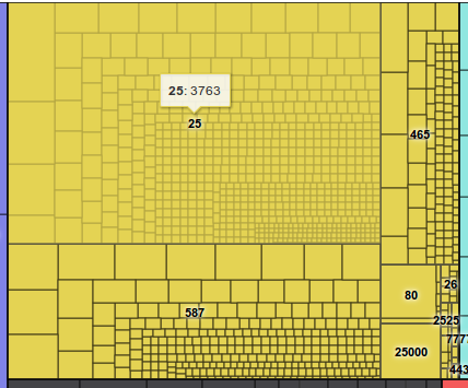
Clicking on the yellow part of the map, we’re drilling down to the activity of each originating IP address. Where there’s room for it, this map shows the target IP addresses, i.e. where the bot has attempted to establish connections. The map now focuses on the yellow area only, i.e. the activity from only one IP address. The map is still divided into rectangles, representing target ports.

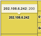
At this level, the destination ports are visible when hovering the mouse over the different general areas of the map. The biggest upper left area is towards port 25, lower left is port 587, upper right is port 465, and in the lower right corner we find less frequently attempted ports like 80, 25000, 2525 etc. By hovering over an IP address, the map will show the number of attempted connections against that IP address and port.
As mentioned earlier, all the outbound connections are of course being denied – even though the intruder is given the impression it’s perfectly doable. So if you find your own IP address somewhere in these screenshots, you’re not under attack – at least not via my systems…